We read 54 SaaS homepages across 11 years. Here is what actually changed.
AI language appeared in a heading on 0% of these homepages in 2018 and 61% by 2026. Meanwhile the median homepage went from one call to action to four, and headlines got longer. Both go against what conversion advice usually recommends.
Three things changed on SaaS homepages between 2015 and 2026, and two of them run against standard conversion advice.
AI language went from absent to a majority. The median homepage went from one call to action to four. Headlines got longer, not shorter. All three are measured from archived captures, not recalled. If you are auditing your own SaaS landing page, the second and third findings are the ones worth arguing with.
What we measured on 54 SaaS homepages
Every homepage in this study was read from Wayback Machine captures, one per year where the archive held one, from each company's earliest usable capture through a live read in 2026. That produced 542 usable snapshots across 54 companies, spanning 2015 to 2026.
For each snapshot we extracted the page title, meta description, H1, every H2 and H3, all clickable elements, and navigation links. The companies range from Stripe, Slack, and Datadog to Linear, Supabase, and Vanta. They were chosen for recognisability and archive depth, which matters for the limitations section at the end.
Everything below counts what was on the page. Nothing below is evidence that any change improved conversion, because none of these companies published what happened next.
AI language went from absent to a majority in three years
In 2018, not one homepage in this sample mentioned AI, agents, or intelligence in a heading. By 2026, most of them do. This is the cleanest signal in the dataset. 27 companies adopted the language. Exactly one dropped it.
AI language is defined as a heading matching: AI as a standalone word, agent, intelligence, LLM, GPT, or copilot. Each year's figure is the share of that year's captures containing at least one such heading.
Two things stand out in the shape of that curve. The first movement is 2019 to 2020, well before ChatGPT. A small group of data and analytics companies already used the word, mostly to describe modelling rather than generative features. The curve then flattens for two full years.
The real inflection is 2023, and the steep part is 2025 to 2026. Between those two years the share nearly doubles.
This measures what homepages say, not what products do. A heading is cheap. Whether the underlying software changed as fast as the copy did is not a question an archived page can answer.
The consequence is uncomfortable for anyone writing a homepage right now. Radical differentiation works by finding the dominant convention in a market and doing the opposite. At 61%, AI language is the dominant convention. A claim that more than half your category makes is not a differentiator. It is table stakes, and table stakes are what buyers stop reading.
That does not mean removing it. It means the differentiation has to sit somewhere else: in what the AI is pointed at, in the proof, in the specific job it does for a specific buyer. If your headline could be pasted onto a competitor's site without anyone noticing, the 61% has already absorbed you.
This is the move I made with Screenplay Performance Studio, which arrived positioned as an AI audio tool. The product worked. The framing did not, because "AI audio tool" told a visitor nothing about where to start or what they would end up with. We reframed it as a specific screenplay performance workflow: upload, casting, perform, export. The AI stayed in the product rather than in the pitch. The label was the least differentiating thing it had.
Vercel, before and after the AI line arrived
The 2021 homepage sold a workflow in three words. The current one sells a category that did not exist when the first was written. Both are competent pages. What changed is the thing the company decided a visitor needed to know first.
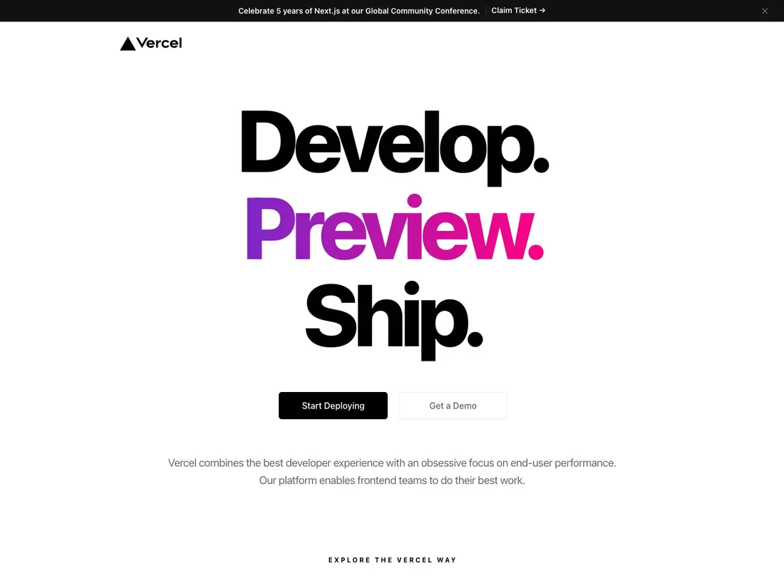
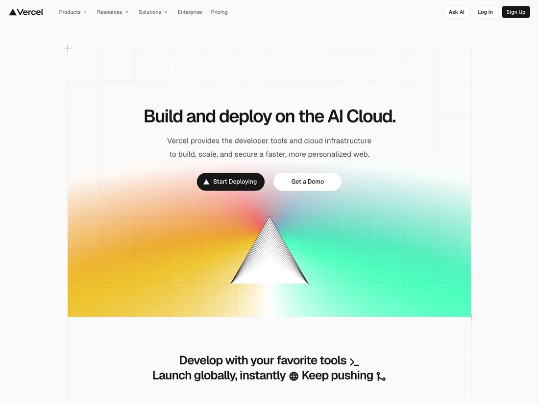
Both captures are from the Wayback Machine archive used throughout this study, cropped to the top of the page so the two are comparable. Full history: Vercel homepage teardown.
Homepages did not simplify. They quadrupled their calls to action.
The most repeated instruction in conversion advice is to reduce choice: one page, one goal, one button. Measured across a decade, these companies did the opposite. The median homepage went from one action CTA to four.
| Direction of change | Companies | Share |
|---|---|---|
| Added action CTAs | 35 | 65% |
| Removed action CTAs | 12 | 22% |
| No change | 7 | 13% |
An action CTA is clickable text of 3–40 characters containing one of: demo, trial, sign up, get started, start, try, contact sales, talk to, book, request, free, buy, subscribe, create account, join. Deduplicated per snapshot. Navigation labels such as "Product" or "Resources" are captured by the extractor but excluded here, because they are not calls to action.
Nearly three companies added CTAs for every one that removed them. The reading is not "add more buttons."
It is that the homepage stopped being a single funnel entrance and became a routing layer: self-serve here, sales-assisted there, documentation for the evaluator who is ready for neither. That is a plausible response to buyers arriving at genuinely different stages, and it is also what a page looks like when nobody can agree on the primary action.
This data cannot tell you which of those two it is for any given company. If you are running paid traffic into a page like that, the question is worth settling deliberately rather than by accretion. That is the practical overlap with conversion rate optimisation work.
There is a reason the one-CTA rule fits landing pages better than homepages. Eugene Schwartz's five awareness levels, from unaware through problem aware, solution aware, product aware, to most aware, describe how ready a visitor is to act. A landing page inherits its awareness level from the ad that sent the visitor, so one CTA can match it. A homepage receives all five levels at once, from branded search, a podcast mention, a competitor comparison, and a returning evaluator, in the same hour.
Read through that lens, the CTA growth in this data is not indiscipline. It is a page trying to solve an orientation problem, the third of the seven levels of conversion, with the only instrument a homepage has. The problem is not having four CTAs. It is having four CTAs of equal visual weight, which leaves every awareness level equally unserved.
I have been on the other side of this. On Pubrella the CTAs competed with each other, and cutting the competing paths down to one clear route with progressive disclosure was part of an overhaul that tripled visit-to-signup conversion. That was a landing page. Its visitors all arrived through the same door, at the same awareness level.
Collapsing a homepage to a single path the same way would stand a decent chance of stranding four audiences to serve one. The instruction that transfers between the two is not "one CTA." It is one unmistakable hierarchy. On a landing page that usually means one button. On a homepage it usually does not.
lemlist went from three action CTAs to ten
This is the largest CTA increase in the sample. Look at it as an orientation problem rather than a discipline problem: every button is aimed at a different visitor, and the question the page has to answer is which one it expects most.
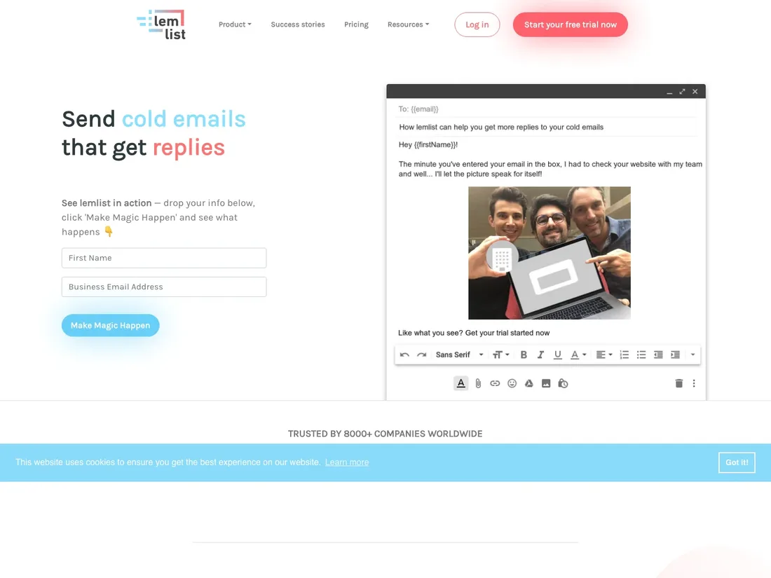
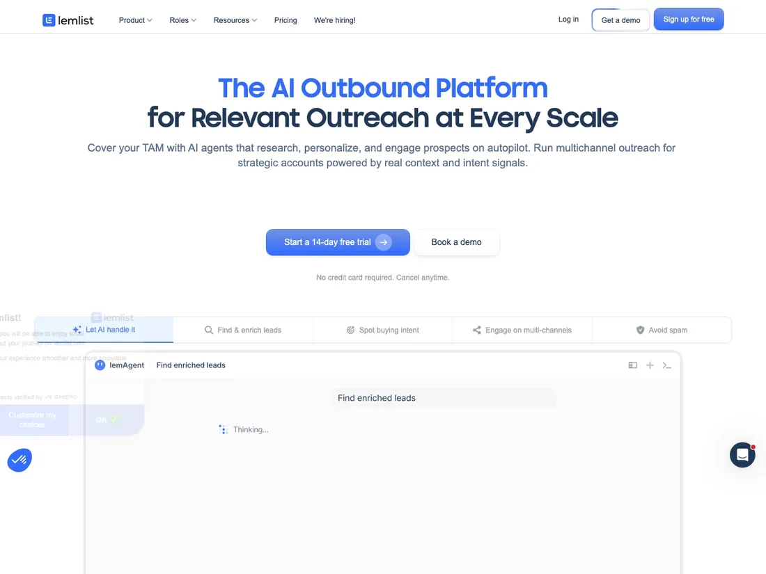
Cropped to the top of each page. Full history: lemlist homepage teardown.
Headlines and meta descriptions both got longer
The advice to cut hero copy and say it in five words is close to universal. These pages went the other way, and so did their meta descriptions, which most SEO guidance assumes have been compressing.
| Element | Got longer | Got shorter | Median words |
|---|---|---|---|
| Primary headline (H1) | 28 | 10 | 5 → 6 |
| Meta description | 24 | 12 | 21 → 22 |
Headline figures cover the 42 companies with a readable H1 at both ends of their range; meta description figures cover the 40 with a description at both ends.
The medians move barely at all. What is lopsided is the direction: roughly three companies lengthened for every one that trimmed, on both elements.
A plausible explanation sits in the added words themselves. Headlines moved from naming a product category to naming a job and an audience. "The issue tracking tool you'll enjoy using" is shorter than "The product development system for teams and agents," but it says less about who the page is for.
The advice these pages are breaking is not the advice most people think it is. The rule from conversion research is that a visitor should understand what you do within five seconds, and that specificity beats generality. Neither of those is a word count. Brevity became the proxy for clarity because it is easier to measure, and a five-word category label can fail the five-second test far more badly than a nine-word sentence that names a buyer.
The test worth running on your own headline is not "can I cut two words." It is the five-second test: show it to someone outside your company, take it away, and ask what the product does and who it is for. Length is only a problem when it buys nothing.
Zembra is the version of this I have watched up close. The site described a review-scraping API and listed endpoints. Accurate, compact, and useless to the AI and ML teams who were the actual buyers, because it named the mechanism instead of the outcome. Repositioning it around data intelligence meant longer, less technical language on nearly every line. The rebrand, site rebuild, and outbound revamp ran together over eight months, so no single element gets the credit. But nothing about that engagement pointed toward fewer words.
Linear traded a category for an audience
The quoted example from the section above, as it actually appeared. The later headline is longer and abandons the category word entirely. A visitor who does not already know what Linear is gets less help. A visitor evaluating it for an AI-assisted team gets considerably more.
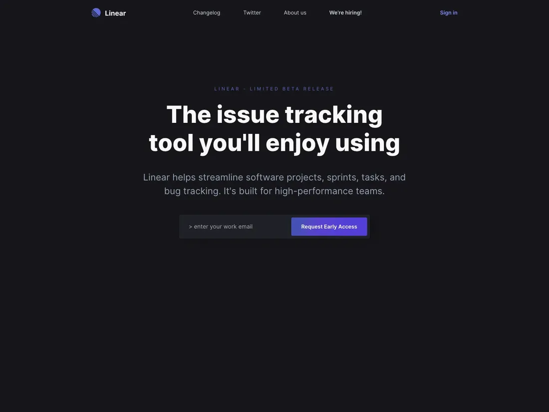
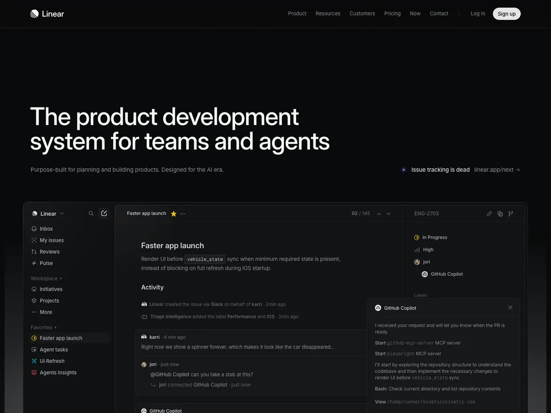
Cropped to the top of each page. Full history: Linear homepage teardown.
What to do with this on your own SaaS homepage
None of the above is a prescription. A trend across 54 companies tells you what the market did, not what your page should do, and half of these companies are probably wrong. What the findings are useful for is deciding which question to ask first. That is the part most homepage rewrites skip.
Three checks, in this order. Each takes under an hour and none of them requires a redesign.
Count the awareness levels your homepage actually serves
Open your analytics and split last month's homepage traffic by source: branded search, non-branded search, paid, referral, direct. Each of those arrives at a different awareness level. Then count your CTAs. If you have one CTA and four distinct sources, you are serving one of them and taxing the rest. If you have four CTAs of identical visual weight, you are serving none. The fix is hierarchy, one dominant action with the others clearly subordinate, not a smaller number.
Run the five-second test on your headline before you shorten it
Show your H1 to five people outside your company for five seconds, take it away, and ask two questions: what does this company do, and who is it for. If they can answer both, length is not your problem and cutting words will cost you. If they can answer neither, the fix is specificity: naming the job and the buyer. That usually makes the headline longer, exactly as it did for the companies in this sample.
Check whether your AI claim still differentiates anything
Paste your homepage headline into a document next to three competitors' headlines, with the company names removed. If a colleague cannot tell which is yours, the AI language is doing no work. That does not mean deleting it. It means moving the differentiation to the layer underneath: the specific workflow it changes, the proof that it does, the buyer it does it for. At 61% adoption, the claim itself is no longer information.
Three data errors were found while producing this study
Each of these changed a number that had already been written down, so all three are reported here rather than quietly fixed. A study that shows none of its own corrections is usually a study that did not look.
What went wrong, and what it changed
- A storage cap that manufactured a finding. The first CTA count came from published article files that store at most ten per list. Twenty-two of twenty-five companies sat at exactly ten. The resulting "net +54 CTAs" was an artefact of that ceiling, and it was about to be published as a confident, contrarian headline. Finding 02 was recomputed from untruncated snapshot records.
- Failed archive captures that faked growth. About one capture in five returns the Wayback Machine's own error page instead of the archived site. A company whose earliest capture failed appears to start from zero CTAs, inventing an increase. Every company with a failed capture at either end of its range was removed from the analysis.
- A parser bug that silently discarded pages. The collector's navigation pattern had no capture group, so it threw on any page containing a nav element, which in practice meant every substantial page. The error was logged as "capture unavailable". Yield went from 45% to 100% once fixed, and the sample more than doubled.
What this study does not show
The findings above are counts of what appeared on archived pages. They are not evidence about performance, and the sample was not drawn at random.
Read the numbers with these five constraints
- This is a convenience sample. The 54 companies were chosen for recognisability and archive depth. They skew toward B2B SaaS with a long public web presence. Nothing here generalises to SaaS as a whole.
- Sample sizes differ per finding. Findings 01 and 02 cover all 54 companies; Finding 03 covers 42 pairs for headlines and 40 for meta descriptions.
- The CTA and AI definitions are English-only. Non-English homepages in the sample are undercounted on both measures.
- Captures are snapshots, not continuous history. A change that appeared and reverted between two captures is invisible here.
- Nothing here measures whether any change worked. No company in the sample published what happened to its conversion rate. Correlation with the calendar is not evidence of effect.
- The three client cases referenced above are illustrations, not evidence. Pubrella, Screenplay, and Zembra were full engagements covering positioning, copy, structure, and in one case outbound, all moving at once, so no single element can be credited with the outcome, and none of them was a controlled test of anything measured in this study. They are here because they show the reasoning being applied, not because they validate it.
Frequently Asked Questions
How many SaaS homepages were analysed in this study?
54 companies, read across 542 usable Wayback Machine captures spanning 2015 to 2026. Companies with a failed archive capture at either end of their range were excluded, because a failed first capture makes a homepage appear to start from zero and manufactures a false increase.
What share of SaaS homepages mention AI?
In this sample, 61% of 2026 captures contain AI, agent, intelligence, LLM, GPT, or copilot in a heading, against 0% in 2018. Measured per company on first versus latest capture, the figure moves from 4% to 52%: 27 companies adopted the language and one dropped it.
Do SaaS homepages have more or fewer CTAs than they used to?
More. The median homepage in this sample went from one action CTA to four. 35 of 54 companies added action CTAs, 12 removed them, and 7 were unchanged. This runs against the common advice to reduce choice on a homepage, though the data cannot say whether the added CTAs helped or hurt conversion.
Should SaaS homepage headlines be short?
The companies in this sample did not act as though they should. 28 lengthened the headline against 10 that shortened it, with the median moving from 5 words to 6. The added words tend to name an audience or a job rather than a product category, which is a trade of brevity for specificity.
Does this study prove these homepage changes improved conversion?
No. It measures what changed on the page, never why and never with what result. None of the companies published conversion data for these periods, so no claim in the study should be read as evidence that a change worked.
Want your homepage read the same way?
I run this analysis on a single homepage, yours or a competitor's, and turn it into a testable list rather than a trend report.
Book a 15-minute callExternal source: All historical page data comes from Internet Archive Wayback Machine captures. Live 2026 figures were read directly from each company's homepage. Three companies originally in the sample, Typeform, Loom, and Miro, are excluded from the Wayback Machine and could not be included. Data source.
SaaS Growth Marketer and fractional growth lead. I help B2B SaaS teams fix positioning, landing pages, outreach, and conversion before they scale traffic.