← Back to case studies
Pubrella
3× landing page conversion through positioning and CRO
How I transformed a confusing SaaS landing page into a high-converting demand capture system — with messaging clarity, friction removal, and CTA optimization.
The problem
Visitors landed, read, and left. No action.
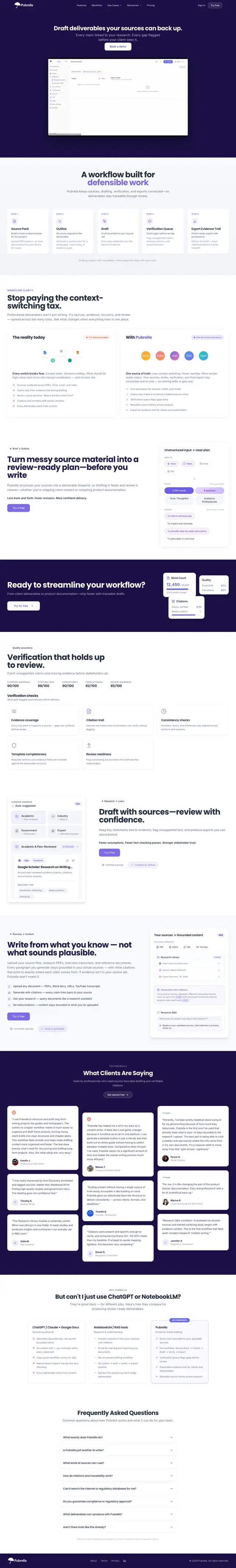
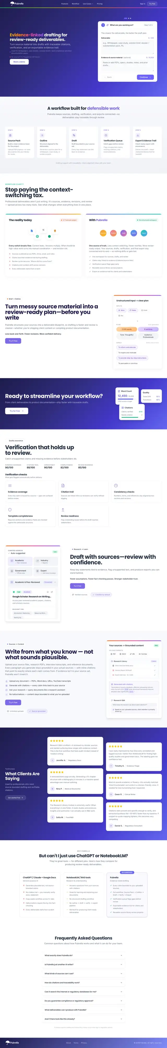
Pubrella had a SaaS product with real value, but the landing page didn't communicate it. Visitors arrived, scrolled, tried to understand what the product did, and then bounced without signing up.
The messaging was vague. The value proposition was buried. The CTAs competed with each other. Trust signals were missing. The page was designed, but it wasn't built to convert.
They needed a full landing page overhaul: positioning clarity, friction removal, trust-building, and a CRO framework that turned visitors into signups.
What I built
From confusing landing page to conversion-optimized demand system
Messaging clarity audit
Rewrote the hero section, value proposition, and feature descriptions to eliminate confusion. This is the core of the SaaS landing page strategy service.
Friction removal
Identified and eliminated conversion blockers: unclear CTAs, missing trust signals, cognitive overload, and unnecessary fields. See the full SaaS conversion rate optimisation service.
Trust signal architecture
Added social proof, testimonials, case study previews, security badges, and credibility markers at strategic friction points. This is part of the SaaS CRO audit and execution service.
CTA hierarchy & flow optimization
Restructured the page flow with one primary CTA, clear visual hierarchy, and progressive disclosure. The full framework is covered in the SaaS landing page service.
Visual proof
The before/after transformation
Before: confusing messaging, competing CTAs, no trust signals, high cognitive load. After: clear value prop, single CTA path, trust-building architecture, friction removed.
BeforeUnclear demand page
- Vague value proposition
- Competing CTAs
- No strong social proof
- High friction
- Unclear buyer journey
AfterConversion demand system
- Crystal-clear value proposition
- Single primary CTA
- Trust signals at friction points
- Streamlined signup
- Guided buyer journey
→
Redesigned landing page: messaging clarity, friction removal, trust architecture, CTA optimization.
The CRO framework
How the 3× conversion lift was achieved
Messaging clarity
Rewrote hero, subheads, and feature copy to make the promise, proof, and CTA instantly clear.
Trust signal placement
Added testimonials, logos, case study snippets, and credibility markers where visitors hesitate.
Friction removal & CTA hierarchy
Reduced competing paths and created a single clear conversion path with progressive disclosure.
Results summary
What it produced
3× conversion lift
Visit-to-signup rate tripled through messaging clarity and friction removal.
Reduced bounce rate
Visitors stayed longer, understood faster, and converted more.
Scalable CRO system
Framework can be replicated across other pages and campaigns.
If you want to understand what this audit covers, see the SaaS conversion rate optimisation service or the SaaS landing page strategy page.
If your landing page gets traffic but doesn't convert, let's fix it.
Book a 20-min GTM AuditFree conversion audit. No pitch. No slides. Just actionable CRO fixes you can implement this week.