How Intercom rewrote its homepage over 3 years
Intercom's homepage didn't just get updated. The headline, section headings, CTAs, navigation all shifted in a consistent direction between Jan 2023 and Jun 2026. This teardown maps what changed, when, and what the patterns may suggest.

4 visual snapshots compared
Audience signal changed
Significant structure changes
Navigation overhauled
Homepage snapshots over time
Each thumbnail shows the above-the-fold area of the homepage at that point in time. Scroll to compare.
Biggest visible changes
Three moments that capture the arc of the evolution.
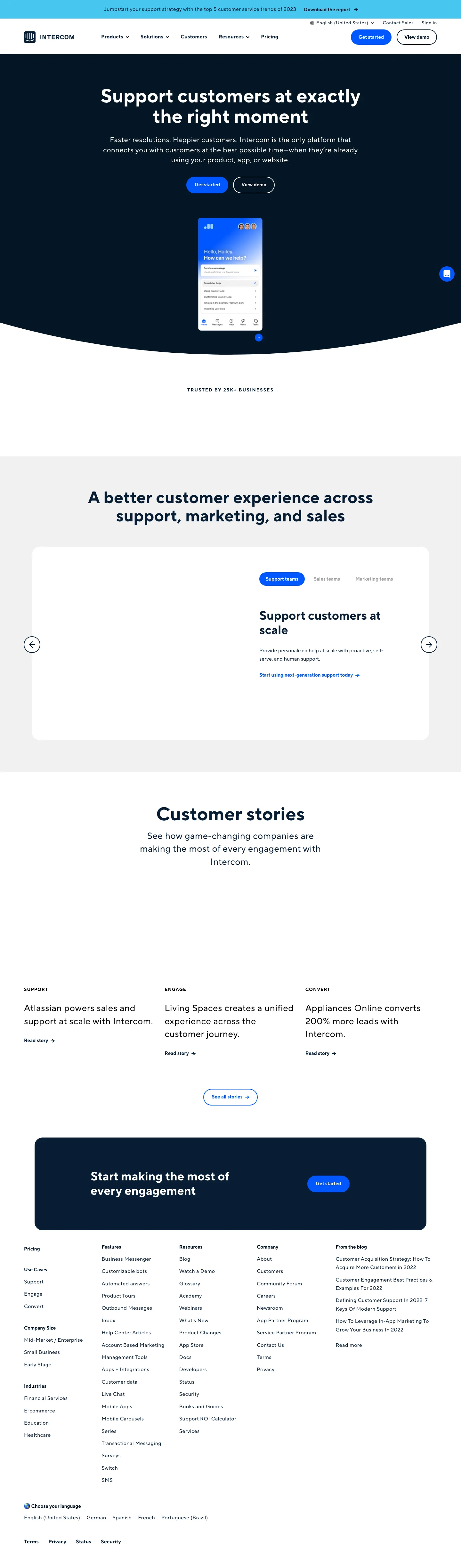
The original: product-led messaging
Click to view full screenshot
- 01
H1 opens with: "Support customers at exactly the right moment" — direct product statement.
- 02
Visible section headings include: "A better customer experience across support, marketing, and sales".
- 03
Navigation includes: "Contact Sales", "Sign in", "Custom Bots" — product category framing.
- 04
Section headings later removed include: "A better customer experience across support, marketing, and sales".
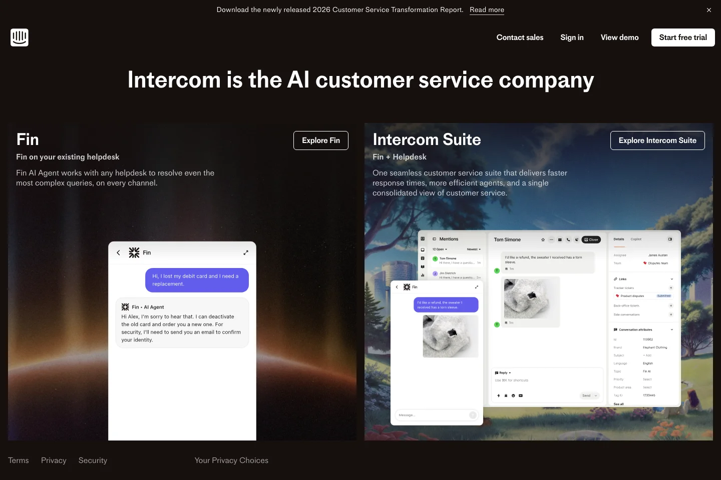
Mid-period: signs of a structural shift
Click to view full screenshot
- 01
Visual similarity to the previous snapshot: 71.0% — one of the larger layout changes in the dataset.
- 02
H1 in this snapshot: "Intercom is the AI customer service company".
- 03
New section headings appearing: "Fin", "Intercom Suite".
- 04
Changes across this period appear incremental rather than a single redesign event.
Today: updated positioning
Click to view full screenshot
- 01
H1 now reads: "The only helpdesk designed for the AI Agent era" — updated value proposition.
- 02
New section headings include: "A complete solution for AI and human agents", "A fully-featured AI-powered helpdesk", "A true partner with deep domain expertise".
- 03
CTAs no longer present include: "Download the report", "Contact Sales", "Watch now".
How the language changed
Verbatim text extracted from page snapshots. No paraphrasing.
"Support customers at exactly the right moment"
"The only helpdesk designed for the AI Agent era"
Reading: This change can be read as a deliberate update to the primary value proposition frame. No confirmed strategy is implied.
"Intercom helps over 25,000 global organizations deliver better customer support via personalized conversations and automated support."
"The only helpdesk with a natively integrated AI Agent. Deliver perfect customer experiences with the highest-performing platform. Start your free trial today."
Reading: Meta description updated. The change in framing may reflect a positioning adjustment or an SEO update.
"Making Internet Business Personal | Intercom"
"Intercom | The only helpdesk designed for the AI Agent era"
These are observations based on text extracted from archived pages. They are not confirmed internal strategy.
What appeared and what disappeared
How the content architecture shifted
- +A complete solution for AI and human agents
- +A fully-featured AI-powered helpdesk
- +A true partner with deep domain expertise
- +Transparent pricing
- +Perfect customer experiences, powered by Intercom
- −A better customer experience across support, marketing, and sales
Patterns worth borrowing
These are observations and inferences — not confirmed strategy from Hootsuite.
Your H1 signals which buyer you are targeting
MessagingThe headline changed from "Support customers at exactly the right moment" to "The only helpdesk designed for the AI Agent era". The framing of your H1 is one of the clearest signals of which buyer you are targeting and what you expect them to do next.
Navigation is a positioning statement
NavigationNavigation items changed from "Contact Sales", "Sign in", "Custom Bots" to "Fin", "Log in", "Contact sales". The labels your navigation uses reveal what you think your visitor is trying to decide — and who that visitor is.
Section headings reveal what the team thinks buyers care about
CRO5 section headings were added and 1 removed between Jan 2023 and Jun 2026. New headings include "A complete solution for AI and human agents" and "A fully-featured AI-powered helpdesk". Headings that disappeared include "A better customer experience across support, marketing, and sales". The pattern of what gets added and removed is one of the clearest signals of how a team is re-prioritizing its value proposition.
Superlatives raise expectations across your entire funnel
CRO RiskClaims like "The only helpdesk designed for the AI Agent era" raise the bar for everything downstream — including the product experience, onboarding, and support. If the homepage signals category leadership and the product experience signals a self-serve tool, the mismatch may create friction at the trial-to-paid stage. This is not a caution against ambitious claims — it is a note that the rest of the funnel must match them.
Incremental changes compound into a brand shift
StrategyAcross 4 snapshots spanning roughly 3 years, no single update here was a dramatic overhaul. The end state looks very different from the start because small, consistent changes in the same direction accumulate. This is worth studying if your own homepage has been drifting without a clear direction.
The visual teardown above shows what changed. This section explains what those changes may mean for SaaS positioning, trust, CTA structure, and conversion paths.
Intercom's homepage underwent a complete rewrite between January 2023 and June 2026. The primary headline shifted from "Support customers at exactly the right moment" to "The only helpdesk designed for the AI Agent era." Navigation was overhauled — eight labels removed, five added — and the page added five new section headings while removing one. The old headline addresses support operations teams focused on workflow execution: it promises a task-based outcome. The new headline targets a different visitor: one evaluating AI-readiness across platforms, likely an IT buyer or product evaluator comparing vendors in an emerging category.
The repositioning signal is direct: Intercom moved from framing itself around outcome timing to framing itself around AI differentiation and category ownership. The new headline makes a singular claim — "the only helpdesk" — that creates immediate proof burden. A visitor who reads "the only" must now see evidence that competing platforms lack native AI Agent integration, or the claim becomes friction. The meta description dropped social proof language ("over 25,000 global organizations") in favor of a platform differentiation claim and a free trial push. This teardown walks through the messaging rewrite, navigation restructuring, visual timeline, and CTA changes observable across four snapshots.
Intercom's homepage changed most visibly between January 2023 and June 2026 in its primary headline, navigation structure, and section organisation across four snapshots.
The primary headline was fully rewritten, changing the audience signal — a shift observable in the H1 copy that may affect who self-qualifies to stay on the page and who exits.
Navigation was consolidated: eight items removed, five added. This could reduce choice paralysis for casual visitors, but may also mean enterprise buyers scanning for specific product capabilities don't find their entry point in the top bar.
Section headings shifted substantially — five new H2 elements added, one removed — which may indicate the page now leads with different use cases or buyer entry points than it did in January 2023.
Taken together, the visible changes suggest compositional restructuring, not incremental refinement.
How the homepage evolved
January 2023 opened with "Support customers at exactly the right moment" — a product-led headline that names the outcome without claiming platform leadership. The visible section structure led with "A better customer experience across support, marketing, and sales", which can be read as function-first framing: the page told visitors what the product does before asking them to believe a positioning claim. That approach reduces first-screen cognitive load for self-serve buyers, but it may underserve enterprise visitors who arrive looking for category signals rather than task descriptions.
October 2025 introduced "Intercom is the AI customer service company" — a shift from outcome language to category ownership. New section headings appeared: "Fin" and "Intercom Suite", suggesting the page began prioritising product architecture over visitor tasks. Visual similarity dropped to 71%, marking one of the larger structural changes in the dataset. This framing asks the visitor to accept a market claim before seeing proof, which may work for buyers who already recognise the brand but creates a heavier burden for cold traffic arriving without prior context.
June 2026 reframed the opening to "The only helpdesk designed for the AI Agent era" — a specificity-driven claim that narrows the category while adding a superlative. New section headings include "A complete solution for AI and human agents" and "A true partner with deep domain expertise", which introduce capability breadth and relationship depth as first-screen themes. CTAs like "Download the report" and "Watch now" disappeared, suggesting a shift away from content-gated lead capture toward direct product qualification paths. That change may reflect a longer sales cycle where the homepage filters rather than converts.
Messaging evolution
The old headline, "Support customers at exactly the right moment," likely served self-serve buyers evaluating speed and workflow fit. The new headline, "The only helpdesk designed for the AI Agent era," is a category-defining claim that targets decision-makers comparing platforms at strategic budget cycles. The old frame promised a capability outcome; the new frame asks the visitor to believe Intercom owns a product category, which shifts the conversion psychology from task-fit to platform evaluation.
The old meta description opened with social proof: "Intercom helps over 25,000 global organizations deliver better customer support." The new meta description leads with the category claim and includes a call to action: "Start your free trial today." This framing appears to serve upper-funnel visitors arriving from search who need to understand positioning before clicking, and it signals conversion intent by naming the trial path directly in metadata.
The new headline creates immediate proof burden: the page must now demonstrate what "AI Agent era" means, why Intercom is "the only" platform that qualifies, and what capability advantage that delivers over legacy helpdesks. Without proof anchored to the claim—comparative functionality, visible AI automation, or buyer testimonials that validate category ownership—the headline may read as positioning rather than value. SaaS founders repositioning around a new category should map every bold claim in the headline to a proof element visible within two scrolls of the fold.
If your page explains the product but does not create trust, the problem is probably message hierarchy, proof, or CTA path friction.
CTA and navigation evolution
Intercom replaced outcome-driven CTAs with product-taxonomy CTAs. The old set—"Start growing business non-stop", "Start converting customers faster", "Start using next-generation support today"—promised a business result in plain language. The new set introduces "Fin AI Agent", "Fully-featured helpdesk", "Natively integrated AI Agent", and "AI-powered Insights" alongside "Contact sales" and "Start free trial". This architecture appears to serve two buyer paths: self-serve trial for smaller accounts, sales motion for enterprise buyers evaluating platform components. The risk is segmentation failure: a visitor arriving cold may not know which path to enter, creating drop-off at the moment of choice.
"Fin AI Agent" as a CTA assumes the visitor already understands what Fin is and which workflow it unlocks. "Start growing business non-stop" required belief in a single outcome—low friction, proof deferred to post-click. The product-label CTA works for mid-evaluation buyers comparing feature matrices, but a support leader scanning the page to assess fit must decode the label before deciding to click. The conversion implication: product CTAs filter for informed buyers, but they may also filter out high-intent visitors who lack context.
Navigation tightened: five items added, eight removed. The removed set included broader discovery paths: "See all stories", "Watch a Demo", "Read story". Removing "See all stories" may reduce social proof discoverability—case studies become gated behind navigation depth rather than surface-level exploration. One founder takeaway tied to Intercom's CTA evidence: if you replace action CTAs with product-name CTAs, the H2s and surrounding proof must pre-load enough context that a cold visitor can predict what clicking "Fin AI Agent" delivers. Without that scaffolding, specificity becomes friction.
Your homepage is a positioning system, not a brochure.
Every headline, CTA, section heading, and navigation label tells visitors who the product is for and what they should believe before taking action.
Lessons for SaaS teams
Based on observable changes — not confirmed strategy or outcome data.
Intercom replaced action-based navigation with product-category labels ("Custom Bots" became "Fin"; "Contact Sales" became generic "Contact sales"). The pattern matters because navigation is not neutral: labels reflect who the page expects to visit and what decision stage they are in. Action labels help a visitor who knows their task; category labels help a buying committee compare platform components. A SaaS founder can test whether visitors arriving from paid search perform better with action-based labels, while visitors from enterprise content perform better with capability-based labels. Do not copy category navigation if most of your traffic is self-serve trial users looking for a specific workflow.
The headline shifted from "Support customers at exactly the right moment" to "The only helpdesk designed for the AI Agent era". That framing moves proof burden from the page to the product: the old headline asks the visitor to imagine a better moment, the new one asks them to believe a category claim before they see evidence. The CRO risk is that superlative framing ("the only") raises expectations for the entire post-click experience — trial onboarding, feature depth, support responsiveness. A SaaS founder can audit whether their product experience matches the ambition of their homepage claim, particularly at the trial-to-paid transition. Do not front-load a category leadership claim if your product onboarding or support experience still signals a self-serve tool.
Five section headings were added and one removed across four snapshots. The new headings include "A complete solution for AI and human agents" and "A fully-featured AI-powered helpdesk"; the removed heading was "A better customer experience across support, marketing, and sales". Heading shifts reveal re-prioritization in compressed form: what the team now thinks matters most and what they believe no longer needs emphasis. A SaaS founder can map their own homepage headings year-over-year to identify whether changes reflect intentional repositioning or reactive drift. Do not add feature-heavy headings if your funnel conversion data shows visitors need outcome clarity before capability depth.
Related SaaS growth resources
Want this kind of teardown for your SaaS?
If your homepage has traffic but weak demos, the problem may not be acquisition. It may be clarity, trust, CTA structure, or conversion path friction.
Book a SaaS CRO diagnosisWant your homepage audited like this?
I review your traffic sources, message match, CTA path, proof structure, and mobile experience — then give you a specific list of what to change and why.
Book a page auditSaaS Growth Marketer and fractional growth lead. I help B2B SaaS founders diagnose landing page, CRO, positioning, and analytics leaks before scaling traffic.