Stripe Homepage Teardown: From Developer API to Enterprise Infrastructure
Between October 2022 and June 2026, Stripe replaced its "Global Payments" headline with a 30-word explanation of what the platform does — and who it serves. The page title shifted from "Payment Processing Platform for the Internet" to "Financial Infrastructure to Grow Your Revenue." These changes signal a move away from category positioning and toward outcome-based messaging. After reading this teardown, you'll be able to test whether your own homepage still relies on a category label — or explains what a customer can actually do with your product.

Quick answer
Stripe replaced its "Global Payments" headline with "Financial infrastructure to grow your revenue" and removed product-specific navigation in favor of audience segmentation paths like "Stripe for enterprises" and "Guide me." This positioning assumes visitors already understand that Stripe processes payments and are now evaluating whether it can handle broader financial operations at scale. If your brand lacks recognition with business executives or developers still need to discover what specific capabilities you offer, this approach may create confusion about what your product actually does.
5 visual snapshots compared
Audience signal changed
Significant structure changes
Navigation overhauled
Homepage snapshots over time
Each thumbnail shows the above-the-fold area of the homepage at that point in time. Scroll to compare.


Biggest visible changes
Three moments that capture the arc of the evolution.
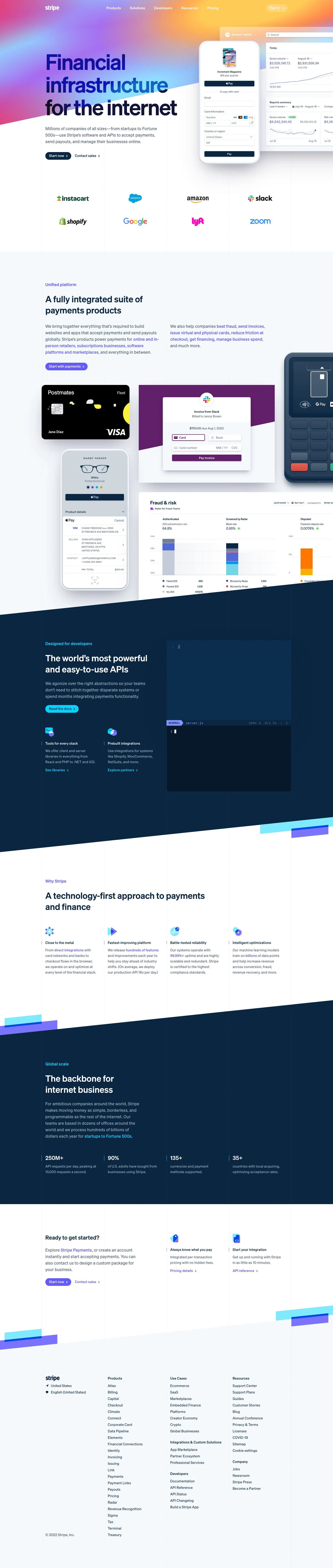
The original: product-led messaging
Click to view full screenshot
- 01
H1 opens with: "Global Payments" — direct product statement.
- 02
Visible section headings include: "Unified platform", "Designed for developers", "Why Stripe".
- 03
Navigation includes: "Pricing", "Sign in", "Payments Online payments", "Checkout Pre-built payments page" — product category framing.
- 04
Section headings later removed include: "Unified platform" and "Designed for developers".
Mid-period: signs of a structural shift

Click to view full screenshot
- 01
Visual similarity to the previous snapshot: 88.1% — one of the larger layout changes in the dataset.
- 02
New section headings appearing: "Enterprise reinvention".
- 03
Changes across this period appear incremental rather than a single redesign event.
Today: updated positioning
Click to view full screenshot
- 01
H1 now reads: "Financial infrastructure to grow your revenue. Accept payments, offer financial services, and implement custom revenue models—from your first transaction to your billionth." — updated value proposition.
- 02
New section headings include: "Flexible solutions for every business model.", "The backbone of global commerce", "Powering businesses of all sizes.".
- 03
CTAs no longer present include: "Contact Sales", "Become a Partner", "get financing".
How the language changed
Verbatim text extracted from page snapshots. No paraphrasing.
"Global Payments"
"Financial infrastructure to grow your revenue. Accept payments, offer financial services, and implement custom revenue models—from your first transaction to your billionth."
Reading: This change can be read as a deliberate update to the primary value proposition frame. No confirmed strategy is implied.
"Stripe is a suite of APIs powering online payment processing and commerce solutions for internet businesses of all sizes. Accept payments and scale faster."
"Stripe is a financial services platform that helps all types of businesses accept payments, build flexible billing models, and manage money movement."
Reading: The new description is shorter and more neutral in tone. Whether this is intentional de-emphasis or a simplification pass is not determinable from text alone.
"Stripe | Payment Processing Platform for the Internet"
"Stripe | Financial Infrastructure to Grow Your Revenue"
These are observations based on text extracted from archived pages. They are not confirmed internal strategy.
What appeared and what disappeared
How the content architecture shifted
- +Flexible solutions for every business model.
- +The backbone of global commerce
- +Powering businesses of all sizes.
- +Reliable, extensible infrastructure for every stack.
- −Designed for developers
Why it changed
The business context behind Stripe's redesign
During this period, Stripe was competing in a payments infrastructure category that had matured significantly, with alternatives like Adyen, Braintree, and Checkout.com narrowing the developer-experience gap that Stripe had historically owned. The original positioning — "Payment Processing Platform for the Internet" — reflected a market where being the best API for developers was a sufficient competitive moat.
Changes in section headings point to a deliberate de-emphasis of developer identity. Removing "Designed for developers" and adding "Flexible solutions for every business model" suggests Stripe was pursuing buyers with broader financial operations authority. The navigation overhaul — replacing product links like "Checkout" and "Radar" with audience paths like "Stripe for enterprises" — is consistent with moving upmarket toward larger contract values.
This evolution maps to a recognizable SaaS pattern: platform consolidation, where a category leader trades bottom-funnel technical precision for top-funnel executive relevance once brand recognition is sufficient to carry the load. For SaaS teams in this space, it suggests that generic "financial infrastructure" framing only works when your name already answers the credibility question before the visitor reads the headline.
What SaaS teams can study
Patterns worth borrowing
These are observations and inferences from Stripe's homepage evolution — not confirmed company strategy.
Stripe replaced "Global Payments" with a 32-word value proposition
MessagingThe original H1 was two words: **"Global Payments"**. The new version runs 32 words and lists three capabilities: **"Accept payments, offer financial services, and implement custom revenue models"**. This suggests Stripe now wants visitors to understand breadth before they scroll. A two-word headline filtered for people who already knew what Stripe did. The new one orients people still researching what financial infrastructure means.
8 navigation items removed is not simplification — it is repositioning
NavigationStripe removed eight nav items including **"Contact Sales"**, **"Become a Partner"**, and **"Payments Online payments"**. Six new items replaced them. The previous nav used product-category labels (**"Checkout Pre-built payments page"**). The new structure likely moves toward use-case framing, though the exact replacement labels are not captured here. When a company removes this many links, it signals a shift in which buyer questions the homepage is meant to answer first.
"Designed for developers" was removed — "Powering businesses of all sizes" was added
PositioningThe old section heading **"Designed for developers"** is gone. The new homepage includes **"Powering businesses of all sizes."** and **"Flexible solutions for every business model."** This points to a deliberate widening of the perceived audience. Developer-first framing filters for technical buyers. Business-size framing includes non-technical decision-makers. The meta description also dropped **"APIs powering online payment processing"** in favor of **"financial services platform"** — another signal of the same shift.
Stripe's April 2023 layout change registered 88.1% visual similarity — the largest shift in the dataset
StrategyThe snapshots show incremental text changes across most months. But April 2023 produced an 88.1% similarity score — one of the largest layout divergences in the five-snapshot period. This suggests Stripe may have tested the new messaging and structure in waves rather than launching everything at once. The section heading **"Enterprise reinvention"** appeared mid-period and is not present in the final version, which indicates continued iteration even after the visual redesign.
Want your homepage audited like this?
I review your traffic sources, message match, CTA path, proof structure, and mobile experience — then give you a specific list of what to change and why.
Book a page auditSaaS Growth Marketer and fractional growth lead. I help B2B SaaS founders diagnose landing page, CRO, positioning, and analytics leaks before scaling traffic.